


Introduction
According to a report by Fortune Business Insights, the data visualization market in 2019 was valued at $8.85 billion. This value is expected to reach $19.20 billion by 2027.
Data scientists have to analyze, interpret, and visualize large datasets daily. This is why they need to have the right data visualization tools.
Data visualization tools enable data scientists to communicate their findings more effectively, which is essential because it will enable them to share their insights with other people who may not be familiar with data science concepts.
This article discusses eight essential data visualization tools to help data scientists make better-informed decisions in 2022.
Top 8 data visualization tools to look out for in 2022
-
Microsoft Power BI
The Microsoft Power BI is the data visualization tool used for business intelligence type of data. It can be used for reporting, self-service analytics, and predictive analytics.
Furthermore, it provides an end-user platform to create reports and share insights with others in their organization. It acts as a centralized repository for all your business data which all your business users can access.
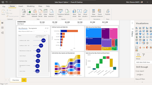
Source: powerbicdn.azureedge.net
2. Infogram
Infogram is an easy-to-use tool with an amicable interface. It offers more than 30 types of charts and visualizations that can be customized. Infogram also give you the option of creating data dashboards with premade templates
Unlike many tools other tools which focus on producing visual dashboards, Infogram is more focused on producing infographics, Facebook posts, slides, posters, and a range of other visuals.

Source: about.infogr.am
3. Tableau
Tableau is a business intelligence tool for visually analyzing data. Users can create and distribute interactive and shareable dashboards, depicting trends, changes, and densities of data in graphs and charts.
4. Zoho Analytics
Zoho Analytics is a data visualization and reporting tool that can help you easily create custom reports and dashboards. With Zoho Analytics, you can:
- quickly create custom reports and dashboards with drag-and-drop ease.
- Get insights into your data with interactive charts and graphs.
- Share reports and dashboards with colleagues or customers in just a few clicks.
Source: zohowebstatic.com
5. Seaborn
Expanding on the matplotlib Python library, Seaborn provides a high-level interface for creating attractive but informative static graphics.
6. Google Data Studio
Google Data Studio allows you to create a visualization for different datasets at the same time, it is designed for teams to access the same data and dashboard. Google Data Studio connects to real-time data connectors such as MySQL, YouTube, and social media platforms like Twitter and Facebook.

Source: codelabs.developers.google.com
7. Qlik Sense
Qlik Sense is a data visualization tool designed for large businesses and people who want to use augmented analytics to analyze data.
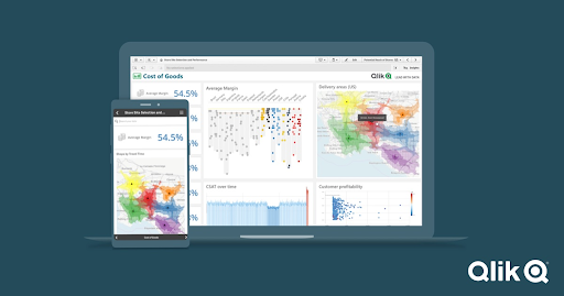
Source: qlik.com
8. Plotly
Another Python data visualization tool, Plotly lets you create interactive graphics, as opposed to static-only visuals. It is an open-source data visualization tool, offering full integration with analytics-centric programming languages like Matlab, Python, and R, which enables complex visualizations. Widely used for collaborative work, disseminating, modifying, creating, and sharing interactive, graphical data. It supports both on-premise installation and cloud deployment.
Closing thoughts
Data visualization is more than just a step of your data science project; it is the core of it. However, often, developers don’t want to spend a long time designing visualization. That’s why BI tools as well as data visualization tools like Tableau offer developers a great choice to spend more time on their code yet produce valuable, clear, compelling data visualizations.